DutchNews.nl - DutchNews.nl brings daily news from The Netherlands in English

21 June 2025
Newsletter Donate Advertise
  • News
  • Life in the Netherlands
  • Jobs
  • Podcast
  • About us
  • Search
  • Home
  • Economy
  • Politics
  • Art and culture
  • Sport
  • Europe
  • Society
  • Environment
  • Health
  • Housing
  • Education
  • News
    • Home
    • Economy
    • Politics
    • Art and culture
    • Sport
    • Europe
    • Society
    • Environment
    • Health
    • Housing
    • Education
  • Life in the Netherlands
    • Latest
    • Opinion
    • Books
    • Travel
    • 10 Questions
    • Learning Dutch
    • Inburgering with DN
    • Food & Drink
    • Ask us anything
  • Jobs
  • Podcast
  • About us
    • Team
    • Donate
    • Advertise
    • Writing for Dutch News
    • Contact us
    • Privacy
    • Newsletter
  • Search

Holland becomes Netherlands on official new logo that cost €200,000

November 8, 2019
The new logo
The new logo

Dutch trade minister Sigrid Kaag on Friday launched a new logo for the Netherlands, replacing the conventional tulip currently used by the tourism board.

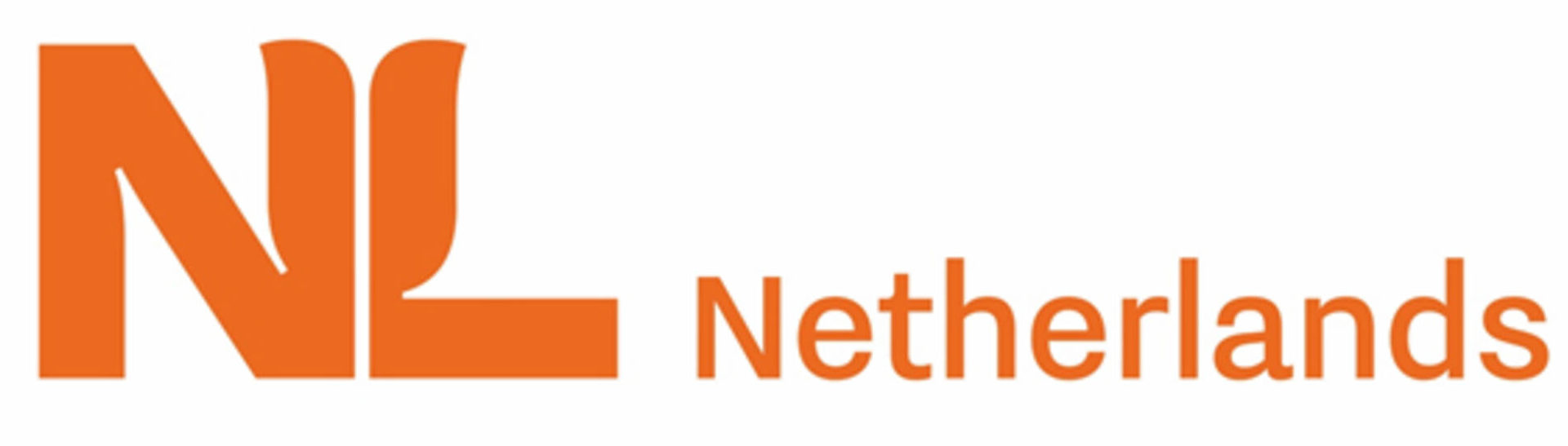
The new logo combines the letters NL with a stylised tulip and was developed at a cost of €200,000. It comes in eight language variations.

The new logo is both positive for exports and attracting investment and talent, Kaag said, and will be used on every trade mission.

‘I am sure most people will understand that costs come before benefits and as we are talking about billions of euros and jobs, that €200,000 is a small amount in the total package,’ Kaag told reporters.

Ministries, embassies, universities, local councils and other organisations working on joint projects with national government will be able to use the logo from January next year.

In October it emerged that the Dutch government planned to stop promoting the country abroad as ‘Holland’ and will instead use The Netherlands’. The detailed plan still has to be published.

A spokeswoman for the ministry told DutchNews.nl the word The had been dropped from the logo ‘because of the layout’.

‘It is a way of abbreviating the name,’ she said. ‘We did the same thing with the French logo (we used Pays-Bas instead of les Pays-Bas). Also as a bonus: it makes it easier to google the whole thing.’

Share this article
  • Facebook
  • Twitter
  • LinkedIn
  • Reddit
  • Copy URL
Society
Thank you for donating to DutchNews.nl.

We could not provide the Dutch News service, and keep it free of charge, without the generous support of our readers. Your donations allow us to report on issues you tell us matter, and provide you with a summary of the most important Dutch news each day.

Make a donation
Latest
Show more
GroenLinks-PvdA members back weapons embargo on Israel
Beautiful addiction: art meets taxidermy in new Amsterdam museum
Amsterdam marks 750th anniversary with party on A10 ring road
Dutch News podcast: The Twisted Family Trees Edition
The phoney war between Timmermans and Yeşilgöz could damage both
NewsHomeEconomyPoliticsArt and cultureSportEuropeSocietyEnvironmentHealthHousingEducation
Life in the NetherlandsLatestOpinionBooksTravel10 QuestionsLearning DutchInburgering with DNFood & DrinkAsk us anything
About usTeamDonateAdvertiseWriting for Dutch NewsContact usPrivacyNewsletter
© 2025 DutchNews | Cookie settings

Help us to keep providing you information about coronavirus in the Netherlands.

Many thanks to everyone who has donated to DutchNews.nl in recent days!

We could not provide this service without you. If you have not yet made a contribution, you can do so here.

The DutchNews.nl team

Donate now

Dutchnews Survey

Please help us making DutchNews.nl a better read by taking part in a short survey.

Take part now