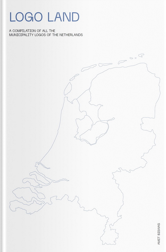
Logo Land: A fascinating look at local history

If you’ve ever visited a bookstore looking for books about the Netherlands, or checked out the books section on this website, you will know just how much choice there is out there.
There are books about how to settle in the Netherlands, how to cook traditional Dutch food or even some of the ugliest places in the country to visit. But until now, there has never been a book explaining the history of the logos of each of the Netherlands’ 352 local authority areas.
Amit Biswas, originally from Bangladesh and now a Dutch citizen, spent two years collecting the stories behind each and every gemeente logo, from Aa en Hunze in Drenthe (four equal sized blocks in blue and green) to Zwolle (a blue block) with 350 in between.
Eindhoven
Biswas got the idea for the book while living in Eindhoven in 2016, when the city started placing beacons with the new logo around the city. ‘I asked one of my colleagues “why does the logo look like this”,’ Biswas says in the introduction.
‘The same evening I went home and did some research on it. The next morning I told him the story behind the logo and its design. He found it fascinating. At the same moment, the wild idea for writing this book was born.’
Two years of research later, using archives, the online archive wayback machine, personal contacts and old newspapers, the book was completed. The project, says Biswas, ‘gave me joy, gave me energy and made me happy’.
Absorbing
As an oddity, Logo Land merits its place in any collection of books about the Netherlands. But there is also something strangely absorbing about it as well.
Amstelveen’s logo for example represents courage and sacrifice (red) alongside strength and loyalty (black) and innocence, chastity and joy (white lettering). Kapelle’s over-complicated design apparently showcases the geographical characteristics of the region, while Texel is a visual representation of the way the name is pronounced.
Some are based on ancient coats of arms, many incorporate curving blue lines to represent water (although Gorinchem opted for red), while Nieuwegein’s spiral is said to showcase ‘a complete and dynamic city’.
Tytsjerksteradiel
Gemeente Amsterdam’s three crosses are one of simplest, Haarlemermeer’s must be the most complex while Tytsjerksteradiel has a letter cloud as logo, involving the first letter of each of the 17 villages which make up its jurisdiction.
If you are the sort of person who likes browsing for obscure facts, are a local history buff or have a collection of cartoon books in the loo, then Logo Land will be the perfect addition to your book shelf.
As Biswas says in his introduction: ‘I hope this book will help you to learn about your municipality through its logo, whether you were born there, currently live there or are just visiting’.
Thank you for donating to DutchNews.nl.
We could not provide the Dutch News service, and keep it free of charge, without the generous support of our readers. Your donations allow us to report on issues you tell us matter, and provide you with a summary of the most important Dutch news each day.
Make a donation